In early November of 2016 I ran a poll asking various questions about people’s personal, political and cultural interests, publishing it for my Facebook friends to fill out. The objective was to get some measure of my “bubble”. The people I befriend aren’t representative of the wider population, and this can lead to a rude awakening when my countrymates narrowly decide to, say, leave the European Union.
There are plenty of polls out there of the general population for me to gawk at in disbelief, but there’s no poll of my friends and acquaintances. So I went ahead and ran one for them, and they were all very obliging in filling it out.
This is the high-level analysis of the Bubble-Mapping exercise. It’s not all that technically sophisticated, and is mostly a collection of charts of varying degrees of attractiveness, along with some speculative commentary on my part.
Summary Gubbins
The poll ran for nine days, between 08/11/2016 and 17/11/2016, and collected a total of 171 responses. At the time of polling I had 646 Facebook friends, and I’d estimate1 that about 350-400 of those are active users who post and comment regularly, so the poll captured about a third to a half of active Facebook Friends and well over a quarter of Facebook friends overall. There is probably some self-selection bias at play here, as there are a bunch of relevant factors which aren’t independent of someone’s willingness or ability to respond to an online poll, but I suspect this is still probably a fairly representative sample.
A word on anonymity
The questions in this poll were deliberately constructed to preserve the anonymity of respondents. I wanted to solicit honest answers about contentious issues, and offering to safeguard people’s identities seemed the best way to do this. These efforts were remarkably successful. Respondents include people I have known for years, have seen in various states of undress, and about whom I could tell eye-wateringly embarrassing stories. In spite of this, I could only recognise perhaps a dozen of respondents, and even those I’m not too sure about.
Section 1: The Roads to Rikk
The first question was How do you know Rikk?, which every respondent answered.
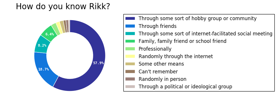
Most of you know me through hobby groups and communities (probably swing dancing or gaming/LARPing). The next highest group is “through friends”, followed by “internet-facilitated social meetings” (probably web forum meetups or OKCupid dates), and “family, family friends or school friends”.
Section 2: Hobbies and Interests
In this section, I asked how long it had been since the respondent last did some sort of activity, with time-horizons of within one week, within one month, within six months, within one year, within two years, within five years, greater than five years, or never. The activities were: going to the cinema; seeing a live musical performance; visiting a museum or gallery; going to a live sporting event; going clubbing or dancing; and playing a board or card game.
There follow some not-very-helpful plots of the findings. This is a very strange plot and you generally shouldn’t make charts like this, but bear with me while I try and justify my terrible decisions.
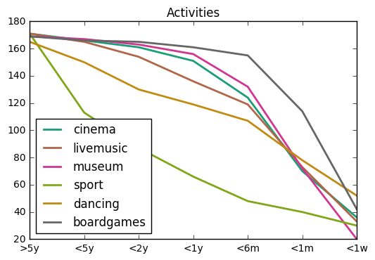
This is a reverse-cumulative-sum plot, so it includes values for more recent time-horizons in the less recent ones. Taking the example of “cinema” (the teal line), the entire cohort has visited the cinema within the longest time horizon (>5 years). Slightly fewer have visited it within the next time-horizon (<5 years), and slightly fewer have visited it within the next.
Across the entire cohort of 170 people, it’s reasonable to take time-since-last-event as a proxy measure of how often the group does that activity. Now, the x-axis on this chart isn’t a remotely sensible scale, because the time intervals I provided weren’t themselves on a sensible scale. If we were to try and adjust the x-axis to be on a linear scale, it’d look more like this:
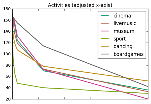
But this also isn’t massively reliable, because in order to take a guess at what “greater than five years” looks like for someone, we need to know their age, and I didn’t ask that. Anyway, horrible assumptions and terrible plotting choices aside, on average, the area under each curve should roughly correspond to how much of an activity my bubble does. Observe these at your leisure.
Some noteworthy facts about my bubble’s activities:
– Surprisingly few active cinephiles: only 41% have visited a cinema in the past month.
– 16% have never been to a live sporting event, and less than a quarter have been to one in the past year.
– My bubble is super-cultured! 65% have been to a museum or gallery in the past month. 78% have been to a museum or gallery in the past six.
– 30% have been out clubbing or dancing in the past week. This is probably because a considerable fraction of my social circle is drawn from the swing dancing community. About 63% have been out clubbing or dancing in the past six months.
– 67% have played a board or card game in the past month, with 92% playing one in the past six months. NEEEEERDS!2
I haven’t been able to find reliable figures for how often people do these activities in the general population3, so I don’t have anything to compare it to, but my intuition is that my bubble is a lot more board-gamey, a lot more dance-going, a lot more museum-going and a lot less sporty than the general population.
It’s not who you like…
The next question was a free-response question asking What do you like doing? This collected 160 answers, many of which were lists of things people liked. I split these out into one big long list and grouped them, with the top dozen or so answers shown below.

Dancing and reading are the runaway victors here, but the grouping on this wasn’t very intelligent, so “dancing” and “swing dancing” are separate, as are various types of “gaming”. There’s a long tail of smaller counts for synonyms of “playing games”, which would probably sum to higher than 20 depending on what you decided to include.
An interesting feature of my bubble, qua its interests, is that it’s very geeky, but it’s also quite socially aggressive. I suspect a lot of the people in it would consider themselves introverts, but in amongst their solitary interests are hobbies that involve meeting new people. I suspect being in London is a heavy influence on this.
The next question was another free-response, simply asking What’s rubbish?. This collected 162 answers, and under the same procedure as the previous question, the top results are as follows:
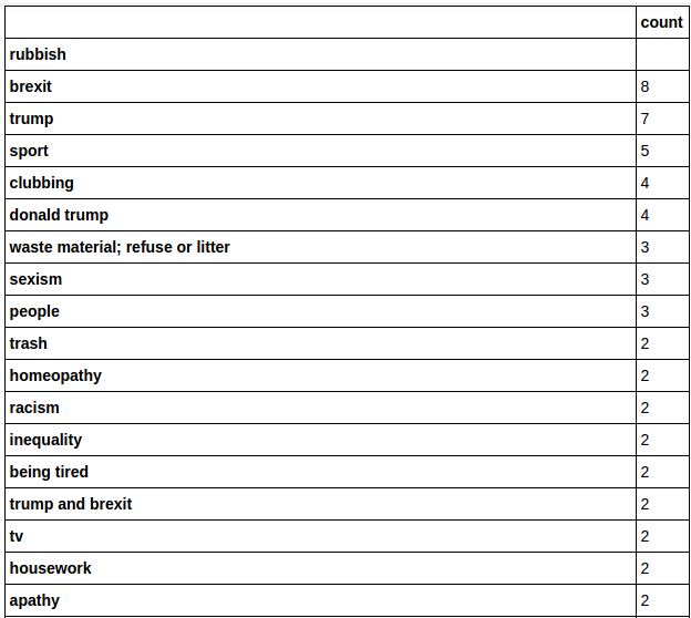
People in my immediate social sphere do not like Trump or Brexit. Politics has its own section, which we’ll get to in a minute, but we’ll certainly see a lot more of Trump and Brexit later. I do quite like how three people independently put the OED definition of “rubbish” in there. We also see sport getting short shrift again.
The takeaway from this section is that my bubble has nerdy, metropolitan, middle-class and slightly counter-culture hobbies and interests, which are very different from the wider population. Importantly, this is the way I meet people, and the way most people who I meet also meet people. If we’re looking for a mechanism which forms groups of like-minded people, this is a very likely suspect.
Section 3: Politics!
This is the bit you were all looking forward to, right? The part where things really start to kick off.
Party Affiliation
So, first things first, my bubble is super-political. The first question in this section asks about membership of a political party. Again, every respondent answered this question, and the results are plotted below.

I’ll talk about the specific make-up of party membership in a moment, but first, let’s compare this side-by-side to a similar plot for the general population of the UK4.
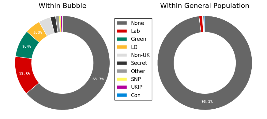
Well over a third of my bubble has political party membership. Put another way, my bubble has political party membership at a rate approximately twenty times that of the general population. This is a highly politically-engaged group, though I’d be curious about how many of these memberships are from long-standing supporters and how many of them are from the various membership surges within the past 18 months.
Of the party memberships, a plurality are Labour, followed by Greens and Lib Dems. We will see this pattern again in voting histories. There is a noteworthy absence of Conservative Party members in this cohort5, and this is also a feature of my bubble’s political make-up which we will see again.
For the observant readers, your eyes do not deceive you: I have a single UKIP member in this cohort, though judging from their other answers, they’re either an infiltrator or very confused.
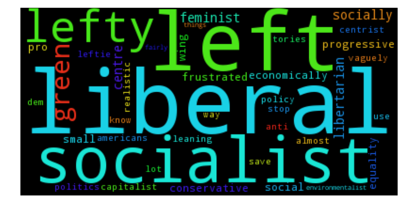
Self-identification
The next question in this section was If you had to describe your political position in just a few words, how would you do it?. There now follows a word cloud on people’s results. Word clouds are bad, and I feel very bad for making one, and you should feel very bad for reading it, and as a small act of protest I’m not going to change the colours of any of the words to match their relevant party or political affiliations. So take that.
 .
.
Very liberal, very left, kinda socialist6. This doesn’t really surprise me, but perhaps it should. I’d probably describe myself as “left liberal”, but five minutes on my Facebook feed tells me most of my friends are way more stereotypically “lefty” than I am, and when I disagree with people on fiscal issues or nationalised infrastructure or whatever, I generally find myself arguing “from the right”7. This is noteworthy because all things being equal I’d expect myself to be in the centre of my own bubble. The fact I’m not is a little suspicious. I’ll propose my theory for why this is the case in a little while.
My favourite answers from this question were “left of Karl Marx”, “Chaotic Neutral”, and “jet fuel doesn’t melt brexit”.
The EU Referendum
The next question asked how people voted in the EU referendum, which every respondent answered. There aren’t any great surprises to me here.
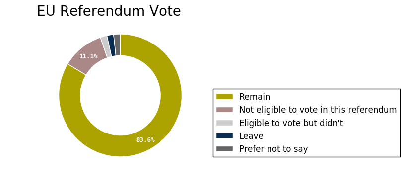
As you can see, this is broadly in line with the actual results. Ho ho ho. I jest. I jest because everything is terrible.
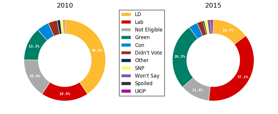
Voting History
The next two questions asked how people voted in the 2015 and 2010 UK General Elections. These questions got 170 and 166 responses respectively, so any discrepancies in the following graphics are probably a result of this.
First we’ll have a look at the proportions plotted as a standard donut chart.
But wait! Since we can pair votes up against each respondent, we can plot this as a Sankey diagram, showing the flow of votes from one party to another across elections.
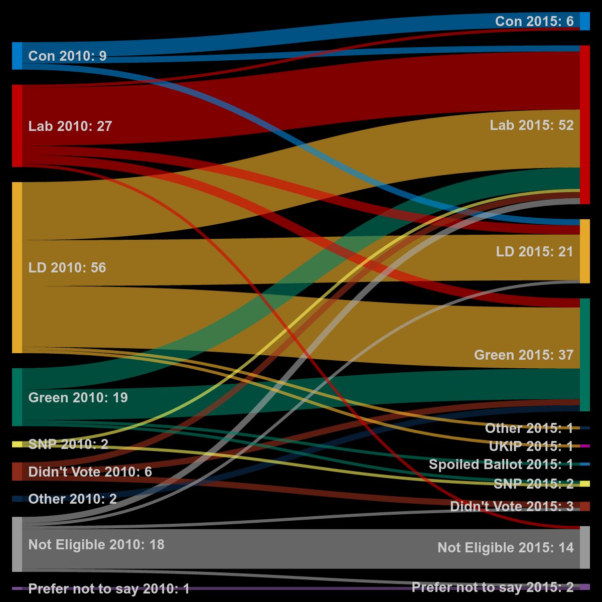
This is retelling a story we’re probably all pretty familiar with by now. In 2010 approximately a third (and the plurality) of my bubble Agreed With Nick and voted Lib Dem. Labour, Greens and the Tories took distant, distant and very distant second, third and fourth places respectively. By 2015 things look very different, with Labour taking the plurality, followed by Greens, Lib Dems (slashed by two thirds!) and an even more diminished Conservative party in fourth place.
(There are a lot of questions I now wish I’d asked in this survey, but the one glaring omission, for which I should be shot out of a cannon into the sun, is not asking for people’s current voting intention. Every single pollster in the world would think I’m a gurning idiot because of this.)
Skeletor, Iago and Thatcher
The next question was testing a pet theory of mine: From your perspective, who are the political bad guys?
You know what? Rather than visualising this in some sort of clever plot, I’m just going to give you some screenshots from the Google Form results page. They capture the essence of the responses to this question better than any chart ever could.
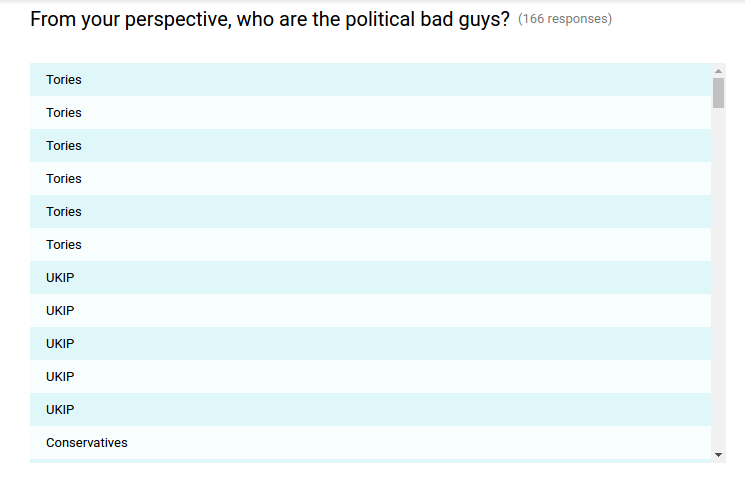
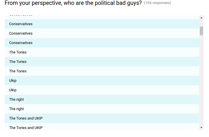
I won’t go any further, because after this the results start to become a lot more distinctive. Also I’ll point out that there are some more detailed and nuanced answers in the cohort, but “Tories and UKIP” is a pretty good first-order approximation.
The pet theory I was testing is that my social circle doesn’t have so much of a coherent political identity, but exists in opposition to “the right”. They might not agree on much between themselves (we’ll see more of that one in a minute) but they know who the enemy is. This theory is now less of a pet, and more of a majestic steed which I intend to ride around upon until the day I die.

Theory, the Wonder Horse
This might also go some way towards explaining why I’m not at the centre of my own bubble. There’s a hard cut-off. Three notches to the right of me and you’re not allowed in. The bubble isn’t one I’ve made by curating who I do and don’t talk to. It’s one I’ve found myself in by dint of being on one side of a cultural divide. Don’t get me wrong, I’d rather be on this side than the other, but there are people four notches to the right of me who I can have productive conversations with, and who I’ll presumably never meet, because they’re stuck in their own bubble wondering why they’re always arguing from the left. I wonder if there isn’t some Tory Rikk out there, who’s from Hertfordshire and plays polo and goes to vintage car festivals, and who gets frustrated about how uncomfortably right-wing his friendship group is.
Pushing the envelope
The next question, collecting 140 responses, asked what do you think is your most contentious or non-mainstream political position?
I realised shortly after publishing the poll that this is essentially asking two very different questions simultaneously: A contentious position can still be mainstream, and a non-mainstream position can lack contention. In spite of this, it’s still fairly easy to see whether a respondent was going for “this position starts fights” vs. “this position gets me funny looks”.
The purpose of this question was to test the “envelope” of the policy space my bubble is happy to support, and I have to admit, I was a little disappointed in how non-weird it was. I’m not entirely sure what I was expecting, (Abolition of schools? Support for the Divine Right of Kings? Monkey Tennis?), so perhaps this says more about me than it does about my bubble.
I’ll briefly go over some points that got multiple mentions:
– Universal Basic Income (or something along the same lines) got 13 mentions
– Open or relaxed borders got eight mentions
– Relaxation of the laws around drug use got six
– Feminism got four explicit mentions, while some level of skepticism around modern social justice culture got three
– Pro-nuclear power got four mentions while anti-nuclear power got two
– Pro-Trident got three mentions, while anti-Trident got two
– Three people wanted to see relaxations of the laws around prostitution
– Four people expressed some level of support for restricting who could vote
– Two people expressed support for euthanasia or assisted suicide
– Two people mentioned prison reform, and two people wanted more compassion towards people who were sexually attracted to children but didn’t act on it
– Two people expressed a desire for reduced military spending.
Answers that particularly stood out for me include the fairly comprehensive proposal for public transport overhaul and whoever it was that advocated public humiliation as punishment for petty crimes. While the latter one wasn’t exactly support for the Divine Right of Kings (or Monkey Tennis), it certainly made me do a double-take.
The final question in this section asked What short political identity do you think will be most well-represented in Rikk’s bubble?. The overwhelming majority of answers involved the words “liberal”, “left”, or both, so you all clearly know who you’re dealing with.
Section 4: Culture
The next section asked respondents whether they recognised entries from a list of names of noteworthy people, and then asked the same of a list of ideas, terminology and concepts. These were presented to each respondent in a random order, and were all drawn from areas that I spend a lot of time in, mixed in with a few people and ideas that I consider to be prevalent in common culture. The point of this was to test my own intuitions about what is and is not common knowledge in my bubble.
Below I’ve plotted the number of people recognising each entry in the list of names.
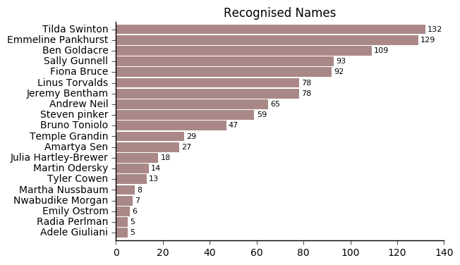
I won’t go through who every single one of these people are. You all have the internet, and they all have a Wikipedia page. All except for Nwabudike Morgan, who’s a character from Sid Meier’s Alpha Centauri. Oh, and Adele Giuliani, who I completely made up, and who was nonetheless recognised by five people. Maybe they thought this was Adele Adkins? I just had to look her surname up, so I wouldn’t blame them. Also there were a couple of typos in this: It was supposed to be Bruno Tonioli off Strictly, and Elinor Ostrom, the late Nobel Laureate political scientist.
None of these seem radically out of order to me, though I feel a little sad for Radia Perlman, who is still alive, is responsible for a networking protocol that basically makes the internet work, and who was nonetheless no more recognisable than someone I fabricated in their entirety.
Here’s the corresponding plot for the “ideas” list:

I didn’t make up any of these. “Piffy on a rock bun” is a real thing, as anyone who appreciates a good barmcake with their chips and gravy will tell you. I’m a little surprised the rule of law wasn’t a little bit more well-recognised as a concept, but again, these don’t seem wildly out of order to me.
I thought I’d experiment a little bit with this, and plot the Pearson correlations between recognition of the names and recognition of the ideas. A larger blue circle represents a stronger positive correlation, while a larger red circle represents a stronger negative correlation.
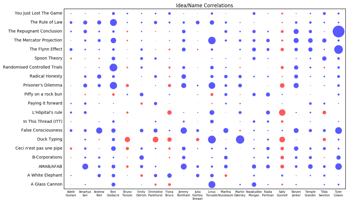
The largest positive correlation is between economist blogger Tyler Cowen and utilitarian population ethics thought experiment The Repugnant Conclusion. This is probably because hardly anyone in my bubble knows who Tyler Cowen is, and hardly anyone in my bubble knows what The Repugnant Conclusion is, but the people who do recognise both these things are mostly the same set of people8.
Other noteworthy features of this plot:
– Linus Torvalds and Martin Odersky are famous9 programmers, and Duck Typing is a programming concept, so that makes sense.
– Ben Goldacre correlates with recognition of lots of listed ideas. He has more “positive correlation mass”10 than any other name. People who recognise Ben Goldacre’s name disproportionately recognise lots of ideas, and vice versa.
– Sally Gunnell is the anti-Ben Goldacre. People who recognise Sally Gunnell’s name disproportionately don’t recognise lots of listed ideas, and vice versa. At first I this might be an age thing. A lot of the ideas are quite modern-internet-meme-type concepts, and Sally Gunnell wasn’t really a household name for people more than a few years younger than me. That said, I would not be the least bit surprised if it turned out to be a more broader cultural division among the people who I know.
This Goldacre/Gunnell divide is made all the more striking by them being the third and fourth most well-recognised names in the list, and is the kind of statistical intuition that’s hard for a lot of people to grasp. Most people recognise Ben Goldacre, and most people recognise Sally Gunnell, but only 60 people out of 171 recognise both, and 82 out of 171 people recognise one but not the other. So if you recognise one of them, you probably know who the other is, but out of the set of people who recognise either of them, most people probably don’t recognise both11.

I’d be interested to see if this divide plays out in other areas, but there aren’t really any other obvious questions that properly divide my bubble.
Section 5: Pot Luck
The final section asked a few miscellaneous questions that didn’t fit into any of the other categories.
First of all, the results for the question “are you religious?” which all respondents answered.
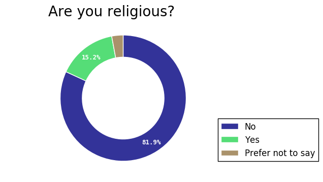
A 2011 poll on YouGov, commissioned by the British Humanist Society, found that about 65% of the British public would answer “no” to this question, making my bubble considerably more secular than the general population.
The next question, which again was answered by all respondents, asked about sexual or gender identity.
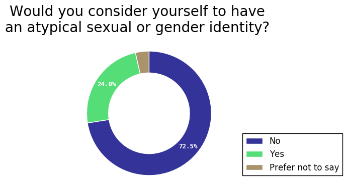
Exact numbers for this question when posed to the general public are contentious and subject to various forms of reporting bias, but even the most liberal of estimates probably wouldn’t put this number higher than 12%. My bubble is super-queer compared to the general population.
I asked two questions about weirdness relative to both general society and to my bubble, but I made a very silly mistake with wording the questions, so these were basically useless.
There were three free-response questions to end this section:
Is there anything you’re really enjoying right now?
148 people responded to this question. The answers were very diverse, including various personal circumstances, an assortment of TV shows, several types of food, and the legalisation of recreational cannabis in three US states.
Is there anything you’re really worried about right now?
158 people responded to this. The overwhelming majority of the responses included a reference to Trump, Brexit or both12. There were also a large number of personal problems people decided to share. You should all give one another a hug.
Anything else you’d like to say?
108 people responded to this question, though about 15% of those responses were to say “no”, “nope”, “not really”, etc. Several of you said complimentary things about me, so thanks for that! It is highly likely I also think you’re cool!
Lots of you expressed the idea that I could probably tell who you were from your answers. In almost all cases, I really can’t. Also a bunch of you said you’d like to hang out with me more. That’s great! Now who are you?
Oh, and one person chastised me for tricking them into being part of an experiment. Considering the original request on Facebook asking people to fill out the survey began with the words “THIS IS AN EXPERIMENT”, I don’t fancy your chances appealing to the ethics committee.
Conclusions
My bubble is mostly formed of people who I know through vaguely counterculture social hobbies. These hobbies tend to be full of educated, middle-class people who have lots of other vaguely counterculture social hobbies where they meet other people. To the extent that my bubble is formed by cultural division, selecting my peer groups in this way may account for a lot of it.
Politically, my bubble is heavily liberal and left-wing, strongly politically-engaged, and has a history of voting outside of the two main political parties. It has a fair amount of support for Universal Basic Income and Open Borders, is quite pro-feminist (though with elements that have modest scepticism towards the modern social justice movement), and is split on Trident and nuclear power. Although individuals express reasonably diverse political identities, one consistent feature is an antagonistic position towards the Tories and UKIP.
Identity-wise, my bubble is heavily secular compared to the wider population. It also has non-mainstream sexual and gender identities represented at a much higher rate than the general population.
Next Steps
Running this survey has given me quite the insight into my local slice of society. This is useful for me. It’s useful to know who I’m talking to when I post on social media. It’s also useful to know that I socialise with people who I disagree with on hot-button topics, without knowing who they are and running the risk of pushing that button. It’s a warning that I should be more tolerant, and shouldn’t treat my political adversaries as some abstract outgroup to ostracise or make fun of.
I would like everyone to have this. Moreover, I think it is relatively straightforward for everyone to have this.
An idea I’ve been throwing around ever since I first ran the poll is a web application which asks questions, and then aggregates the answers to be viewed by your friends on social media. You can find out how your peer group is thinking of voting, or how its opinion splits on divisive issues. You can anonymously express your own dissenting opinion so that your friends know you walk among them, even if they don’t know who you are. If you’re curious about something, you could float your own question, and see how your peer group responds.
I’m envisioning something like “anonymous YouGov for my friends”. It would take a bit of work to put together, and it might not be popular enough to catch on, but it’s certainly worth giving a go.
Thanks to all who filled in the poll. It’s been eye-opening and slightly titillating to pore over your data. I hope one day to return the favour.
By which I mean “pull a number out of the clear blue sky” ↩
Says the man producing charts for the poll he ran amongst his social media friends ↩
In fairness, I didn’t look very hard ↩
cobbled together from various sources; I couldn’t find values for foreign nationals living in the UK who had party membership in their native countries, but this is probably still basically correct ↩
You might recognise the Conservative Party as the people currently running Her Majesty’s Government ↩
I should point out that several of the mentions of “socialist” in these answers came with caveats, like “socialist-lite” ↩
Or as I like to think of it, “from the no-actually-if-we-do-that-everything-will-go-wrong-for-boring-technical-reasons” ↩
To give you some scale/reference, the correlation coefficient between Tyler Cowen and The Repugnant Conclusion is ~0.54 ↩
“Famous” ↩
A statistic I totally just made up ↩
Play with this idea for a little while if you like: if you recognised Ben, what’s the probability you also recognise Sally? If you recognised either Ben or Sally, what’s the probability you recognised both? ↩
If you check the dates, this survey opened on US polling day ↩